
Before readers become captivated by the twists and turns of your plot, before they dive into the glowing reviews that praise your work, and even before they are enticed by the carefully crafted description, it’s your book cover that makes the first—and often most lasting—impression.
In a marketplace crowded with countless titles, your cover is the first thing potential readers see, and in many cases, it’s the deciding factor in whether they pick up your book or scroll past it.
It serves as the gateway to your story, a visual shorthand that encapsulates the essence of what lies within its pages.
This initial encounter is crucial, especially in an era where readers’ decisions are made in the blink of an eye.

Your Cover is Not Just Art—It’s a Billboard
Contrary to what some might think, a book cover isn’t merely a piece of art to be admired on its own.
Instead, it’s a powerful marketing tool designed to catch the eye and resonate with your target readers.
While a cover may be aesthetically pleasing, its true purpose is lost if it doesn’t connect with the right audience.
For indie authors, this is especially critical.
Without the extensive marketing budgets and resources of major publishers, your cover needs to work even harder to grab attention and convey the promise of your story.
The Anatomy of an Effective Book Cover
The primary mission of a book cover is to encapsulate the essence of your book in a single, fleeting glance.
This means:
Conveying Mood and Genre
Your cover should instantly communicate the genre and tone of your book.
In that split-second when a potential reader glances at it, they should be able to identify whether it’s a mystery, romance, sci-fi, or thriller.
This immediate recognition helps to draw in the right audience, making them more likely to pick up your book.
Eye-Catching Composition
The design and layout of your cover need to be visually arresting.
Through the strategic use of colour, imagery, and composition, your cover should stand out on a crowded shelf—or in a long list of thumbnails.
An effective composition invites closer inspection, encouraging readers to click, pick up, or otherwise engage with your book.
Readable Typography
Typography is another crucial element.
The font you choose must be legible and striking, aligning with the expectations of your genre.
A well-chosen font not only makes your title and author name easy to read but also adds to the overall mood of the cover.
It should be bold enough to grab attention but also harmonious with the rest of the design.
Less is More
Simplicity is often the key to an effective cover.
An overcrowded design can confuse potential readers, diluting the impact of your message.
By keeping your cover straightforward and focused, you ensure that the essential elements stand out, making it easier for readers to understand what your book is about at a glance.
Thumbnail View
In today’s digital age, your cover must also be effective in a much smaller size.
Many readers will first encounter your book as a tiny thumbnail on a website or in an ebook store.
It’s essential that your cover looks just as compelling in this format, with clear imagery and readable text even at reduced sizes.
The Importance of Professional Design
Creating a cover that hits all these marks is no small feat.
Most authors don’t have the design skills to master every element—from mood-setting and genre signalling to composition and typography.
This is why professional help is often indispensable.
A skilled designer can translate your vision into a cover that not only looks good but also works effectively as a marketing tool, drawing in the right readers and helping your book stand out in a competitive market.
An Example from My Shelf
Take the cover of my own book, Guild of Assassins.
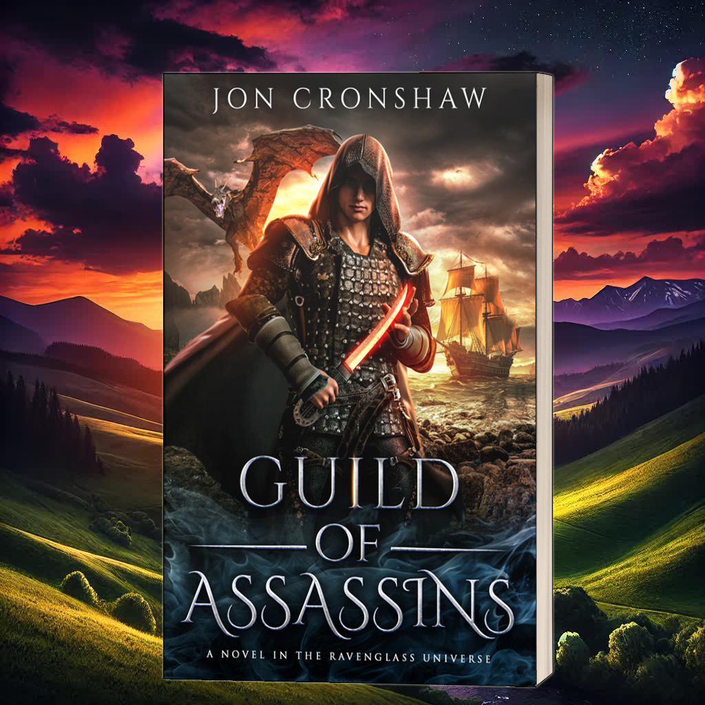
It’s pretty bad-ass, don’t you think?
But it’s more than just a cool design; it’s a cover that adheres to all the key principles of effective book design.
Everything from the colour palette to the typography and the placement of the character is carefully crafted to appeal to readers of the assassin fantasy sub-genre.
Each element is chosen not just for aesthetic value but for its ability to communicate the genre and tone of the story within seconds.
Would this work for a romantic comedy, or a work of literary fiction?
No. If anthing, this cover will put off those readers.
And that’s a good thing.
It was designed with a specific purpose in mind: to entice the right readers while gently discouraging those who might not be interested in what I write.
I’ll be honest—I like this cover a lot, but you won’t see it hanging in a gallery.
Why?
Because it wasn’t designed as a piece of art.
It’s a billboard.
It’s a marketing tool, a symbolic first impression that either draws in the right audience or lets them know this might not be their cup of tea.
To Break or Not to Break Conventions
Now, there are times when breaking away from the norms of cover design can lead to something striking and successful.
There are covers out there that defy conventions and still manage to grab attention in all the right ways.
However, there’s a significant risk involved when you choose to deviate from the expectations of your genre.
When your cover doesn’t align with what readers anticipate, you might end up confounding your audience rather than intriguing them.
A perfectly good book can be overlooked simply because its cover gives off the wrong signals—suggesting a different genre or tone than what’s actually inside.
Ultimately, my goal as an author is for my stories to be read and enjoyed.
The cover is the very first step in that journey, the first handshake with my reader.
It’s the packaging that promises a certain type of experience, and getting it right means that promise will attract the readers who will appreciate it the most.
So while breaking conventions can sometimes pay off, I prefer to make sure my cover is doing its job—guiding the right readers to the stories I’ve worked so hard to create.
Your book cover is much more than a simple visual.
It’s a crucial marketing tool that can make or break a reader’s decision to pick up your book.
By adhering to genre conventions, you significantly increase the chances of your book finding its ideal audience.
Ensuring readability is key to making your cover effective.
Creating a design that instantly conveys the mood and essence of your story helps attract the right readers.
While there’s always room for creativity, understanding the primary function of your cover as a billboard for your book is essential.
This understanding will guide you in making design choices that truly resonate with potential readers.
Remember, your cover is the first step in a reader’s journey with your book.
It’s your chance to set the right expectations.
It’s your opportunity to invite readers into the world you’ve created.
How do you approach your book cover design?
Do you prefer to stick with genre conventions?
Or do you like to experiment with something a bit more unique?
Share your thoughts and experiences in the comments below.
I’d love to hear how you balance creativity with market expectations.
